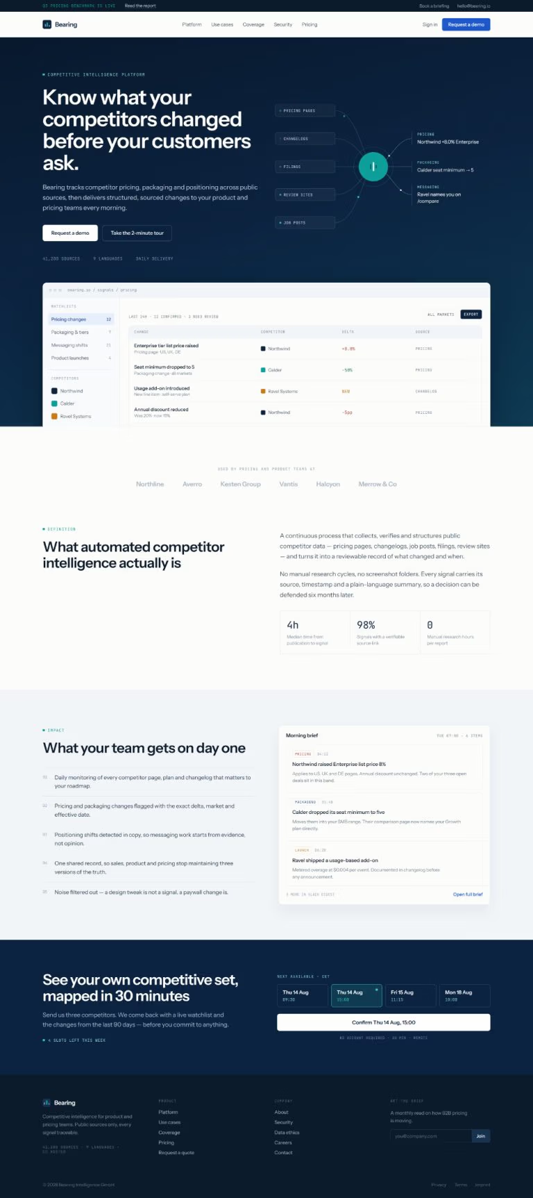
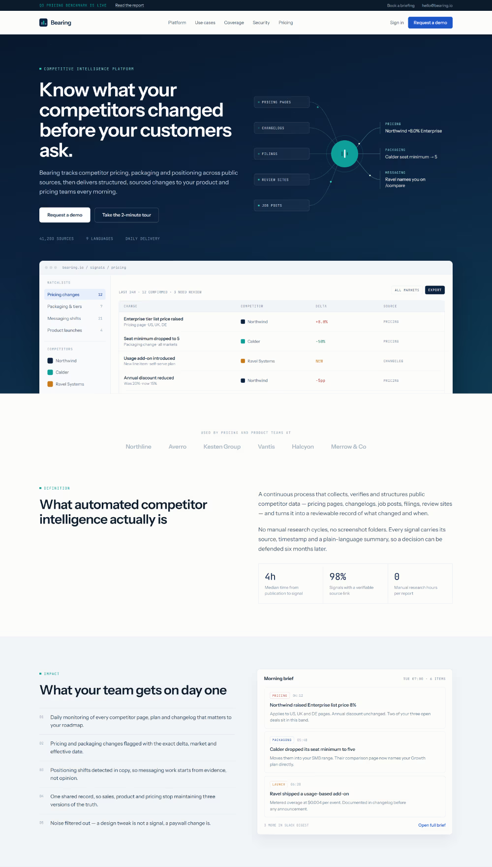
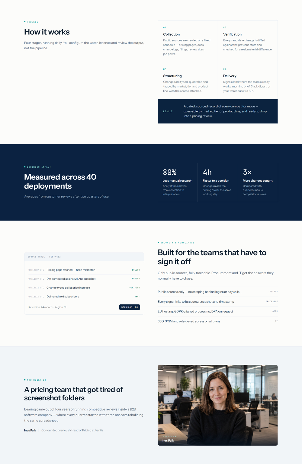
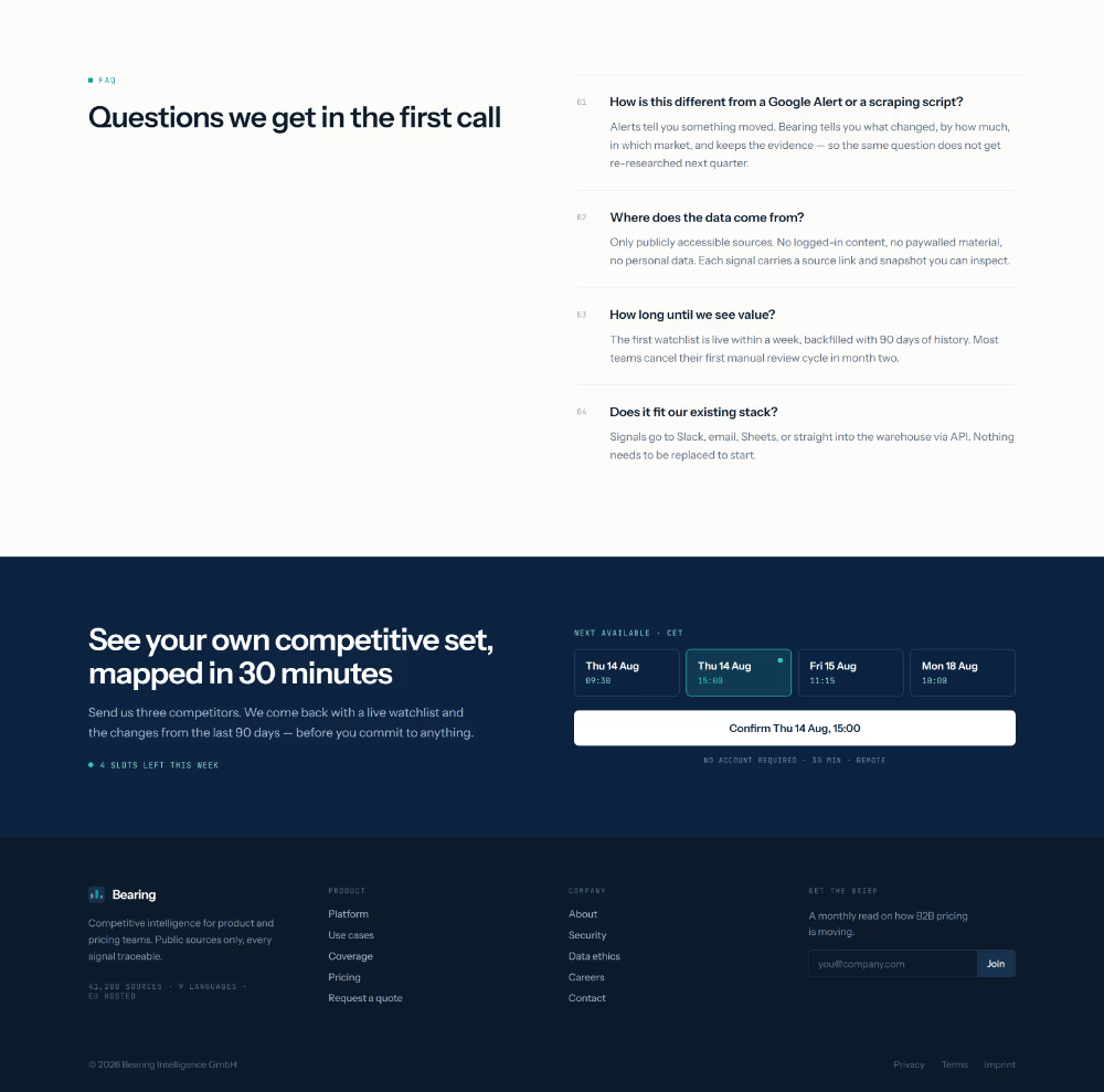
We built the identity around the idea of an instrument rather than a dashboard. A narrow navy-to-petrol range carries the dark sections, with teal reduced to a six-pixel accent mark — never a button, never a gradient. Three data colours (up, down, new) were reserved strictly for numbers, so colour always means something.
Typography does the heavy lifting: Instrument Sans for anything readable, JetBrains Mono for labels, metrics, timestamps and source tags. That monospace layer is what makes the product read as a measuring tool instead of a marketing site.
Rather than illustrate the pipeline, we showed its output. Every page carries a real artifact:
- The homepage opens with an animated convergence diagram — five source types flowing into one node, three typed outputs leaving it — beside a live signals table
- The platform page shows an actual before-and-after price diff, the most persuasive object in the whole project
- The security page leads with a data-flow panel proving there is no inbound path into a customer’s systems
- The closing call to action offers real booking slots with one pre-selected, so the button names the commitment instead of saying “get started”
Copy was written per page, per reader. Coverage publishes the source table with cadences and an explicit out-of-scope list. Data ethics states the work we would decline. Pricing is charged per competitor tracked rather than per seat, with a section defining exactly what counts as one competitor — because per-page pricing is the usual trick in this category.
For handover we produced an Elementor PRO website where every element carries its own global styles across desktop, tablet and mobile breakpoints.